


Steinweiss, Fujita & Album Cover Art
You don’t pick peaches in the rain....


Character cannot be developed in ease and quiet. Only through experience of trial and suffering can the soul be strengthened, vision cleared, ambition inspired, and success achieved.
—Helen Keller
My dad grew up in poverty during the Great Depression in Fruitvale, Colorado, a small farm town outside Grand Junction. He hated rain in the morning but loved it in the afternoon.
In the morning before school, he delivered newspapers. When it rained, the dirt roads turned to mud, and he’d have to borrow the neighbor’s horse to deliver the papers. After school, he worked in a peach orchard. When it rained, he didn’t have to pick any peaches (you don’t pick peaches in the rain); but even though he wasn’t working, he was paid the same for his time.
He went on to become valedictorian at Grand Junction High School. However, with no money, contacts, or hope for college, he joined the Air Force and served during the Korean War. After the service, he used the G.I. Bill to enter the engineering school at the University of Colorado, where he graduated second in his class. He went on to work on the first nuclear-powered spaceship.
Jazz musician Gigi Gryce (his songs are featured throughout this week’s journey) and graphic artists Alex Steinweiss and S. Neil Fujita, like my dad, all came from very humble beginnings and with hard work, perseverance, and a passion for their work built inspiring careers.
Although David Stone Martin, a popular graphic artist in the 1950s, is my favorite album cover designer (we’ll “cover” his design work later on our jazz journey), the history of album cover art started way back in the late 1930s, when Columbia first revolutionized the way music was packaged and sold.
Alex Steinweiss
“Why not develop packaging for your record collections that feature bold, colorful illustrations that will entice the customers instead of the basic brown paper bags we’re using?”
—Alex Steinweiss
In 2009, Taschen published a stunning book called, Alex Steinweiss: The Inventor of the Modern Album Cover. One of the authors is Kevin Reagan, art director of several record companies and cover designer for, among many others, Madonna, Beck, and Sonic Youth. “As for me,” he says, “Alex Steinweiss is much more than the father of record covers. He revolutionized the way we sell music, but it is even more important that it revolutionized the way we visualize music, in which we see music.”
Alex Steinweiss grew up very poor in Depression-Era New York in Brighton Beach (Brooklyn). His father was a ladies’ shoe designer from Warsaw, Poland. His mother was a seamstress from Riga, Latvia. She was very strict, yet all she told him was: “No paint on the floor!” He made a table for himself from plans in Popular Mechanics magazine. He bought a board that was used to roll out dough, made a base, and set it up at an angle. He got goose quills from the butcher and cut his own nibs. Then, as he explains, “I practiced and practiced and practiced all the scripts, and finally got my hand to do what I wanted it to do. That was the beginning.” On the strength of his high school portfolio, he won a scholarship to Parsons School of Design in New York. After graduating, he got a job with Viennese painter and graphic artist Joseph Binder, who had a clear and defining influence on his style. This is how he describes how he got that job:
I showed up unannounced at (the German graphic design artist Lucian Bernhard’s) studio on East 86th Street. His son, Carl, came to the door and asked, “What can I do for you?” I told him I was graduating from school. He said: “Don’t you know you’re supposed to call for an appointment?” I apologized and he looked in the portfolio anyway, and apparently liked what he saw. He said, “Sit down, and I’ll get the master to look at it.” For about a half hour I was sitting there in a pool of sweat. Then Lucian comes out, and he said (puts on a thick German accent) “Mishta Shteinweiss, I have looked at your work and I like it very much, and I have already called my friend Joseph Binder, who just came from Vienna, and is looking for an assistant.” So I took the bus down to Binder’s apartment on 59th Street, and he hired me and another guy.
He worked for Binder for three and a half years until 1939, when an old friend mentioned that CBS had bought the American Gramophone Company, renamed it Columbia Records, and asked if he would be interested in becoming the art director. He interviewed with Pat Dolan, the advertising manager at CBS, who told him, “Well, you’re a little young for the job, but let’s give it a shot.” They hired him and gave him a small space at company headquarters. His only weapons were a drawing board, ink, brushes and pencils, and an airbrush.
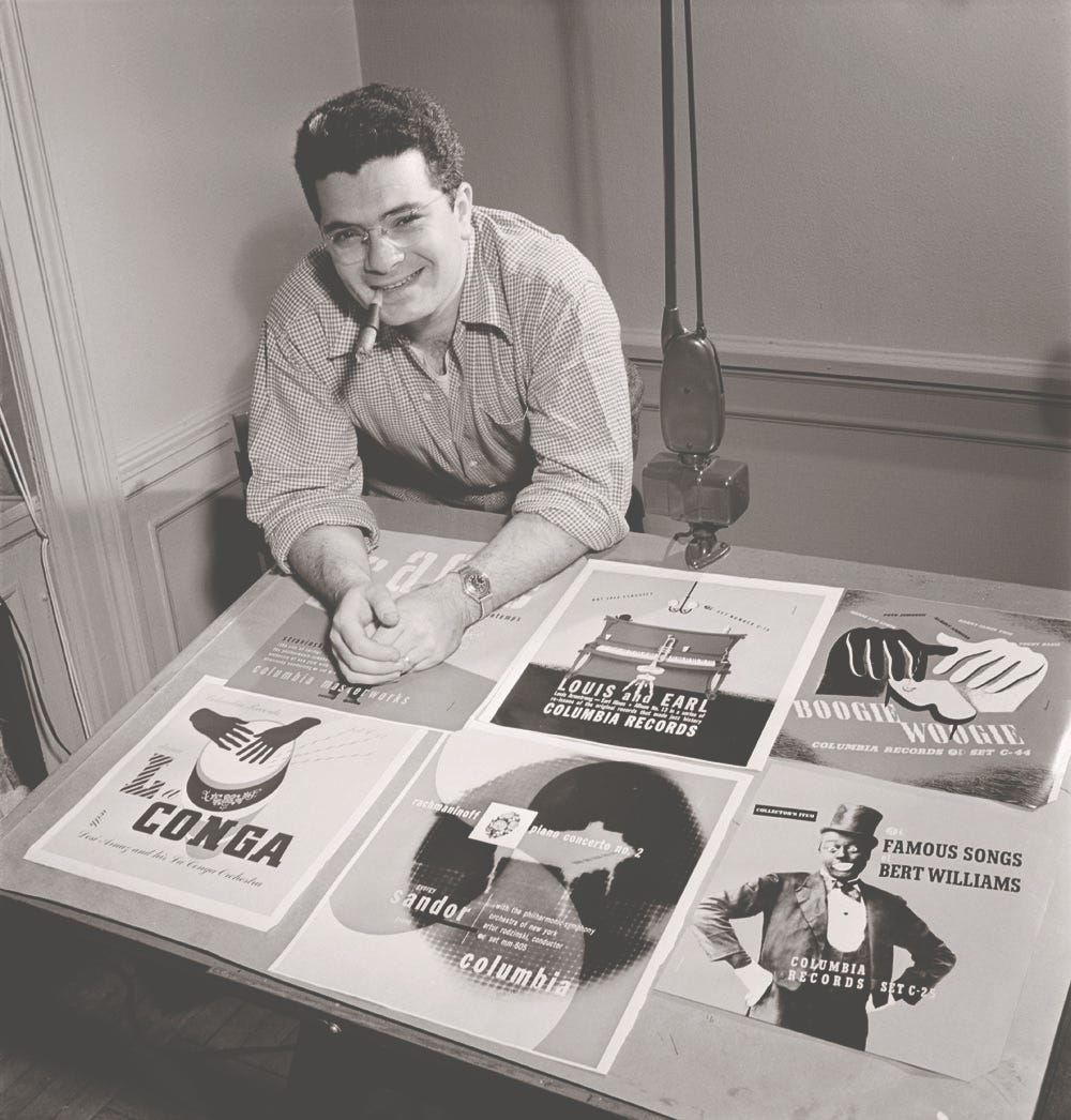
Speaking about record covers at that time, Steinweiss said, "I convinced the executives to let me design a few. The way records were sold was ridiculous. The covers were brown, tan, or green paper. They were not attractive and lacked sales appeal.”
He instead sought out original artwork for the albums. His first cover was for a collection of Smash Song Hits by Richard Rodgers and Lorenz Hart performed by the Imperial Orchestra. It was just a high-contrast photo of a theater marquee with the title in lights; however, it made a huge splash.

His next packaging job was for an edition of Beethoven’s Eroica symphony conducted by Bruno Walter.

Columbia Records’ new album cover phenomenon was featured in Newsweek magazine, which reported that sales increased ninefold when the album cover was illustrated.
With the invention of 33 1/3 RPM records in the late 1940s, a new packaging format was required, and record companies began using a fold-over sleeve format allowing for a new era of experimentation in album cover design and art. Eventually, photography and typography also took on major roles in the marketing of records. After World War II, an edgy modernism was introduced to album covers.
The modern-art-influenced jazz covers of Neil Fujita
In 1954, to build on the work of Steinweiss, William Golden, the creative director of advertising and sales promotion, and the man behind the classic CBS Eye,

hired Neil Fujita, a talented, young graphic designer from L.A.

Born in 1921 in Waimea, Hawaii to Japanese immigrants, Sadamitsu Fujita attended a boarding school in Honolulu, where he adopted the name Neil. After high school, he moved to Little Tokyo in Los Angeles and later enrolled at Chouinard Art Institute. However, after the attack on Pearl Harbor, his studies were interrupted by World War II, and he was forced to relocate first to the Pomona Assembly Center outside Los Angeles and later to the Heart Mountain Relocation Center in Wyoming.

During his confinement, he worked as the art director of the camp newspaper, the Heart Mountain Sentinel. He designed the mast heading for the paper below:

One year after arriving at Heat Mountain, in 1943, he enlisted into the U.S. Army and was assigned to an all-Japanese unit the 442 Regimental Combat Team, and served proudly in Europe.

After serving in the war, he re-entered Chouinard Art Institute on the G.I. Bill and studied fine art and graphic design. After graduating, he moved to New York and began what became a brilliant art career, designing some of the most iconic album, book, and movie artwork of the mid-20th century. He was one of the masters of modern design.
For Fujita, Jazz represented freedom. He believed Jazz album covers called for abstraction, a certain kind of stylization, using modern painters. In 1957, Gigi Gryce and Donald Byrd’s Modern Jazz Perspective was Columbia Records’ first jazz album to feature striking cover art associating jazz music with abstract visual art. The cover was designed by Fujita, who later designed two other classic Columbia releases using the same artistic concept: Dave Brubeck’s Time Out:

and Charles Mingus’s Mingus Ah Um:

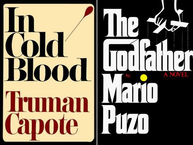
I came to know him first from his album covers; however, Neil Fujita is perhaps more well-known for his iconic book covers:
As I have shared already many times on my jazz journey, I am attracted to particular albums because their covers look cool. At “Ground Zero”, the West Point Cadet Library, where I really discovered jazz, one of the first albums I picked out of the jazz stacks was this Miles Davis classic - also designed in 1957 by Fujita:

Here’s an excellent, must-watch short video of Fujita’s tremendous influence on album and book cover art history:
I saved my favorite Gigi Gryce song for last - one more for the road…
I have always been fascinated by album covers. I love to just pull out my records and hold them and admire their artistic value beyond the music itself. I could have featured many great designers, but Steinweiss and Fujita captured my heart for their personal stories, as much as their artwork. They were the true pioneers.
Next week, we’ll begin a section of that Big River called Jazz where each week focuses on one of my favorite jazz musicians and their music, starting with Jimmy Blanton.
If you like what you’ve been reading and hearing so far on our journey, please share my newsletter with others - just hit the “Share” button at the bottom of the page.
Also, find my playlist on Spotify: From Fred Astaire to Sun Ra.
Feel free to contact me at any time to talk shop. I welcome and encourage that….
Until then, keep on walking….